Diary Entry
In this project I had to re-shoot all of my images three times until they finally came out good enough to be processed and made into prints. I was having trouble with the aperture used on the camera since I wasn't letting enough light coming in which resulted into the negatives coming out really clear. On the third reshoot I was advised to used a tripod and reduced the shutter speed to a really low number so that it could let in enough light. The reason why a tripod was needed is because when you are dealing with such low shutter speed it is important that everything stays stills and this includes the camera itself and the thing or person that is posing for the photographer or else the image will come out distorted and not pretty. After I did all of this the negatives finally came out good for processing. It was so much easier to work with than the last negatives and I was able to finish two prints in one class and the third and last print on the next class. I hope that I have learned from this project because this is something that can't be happening for every project since it wastes a lot of time to work on it and end up being really late. I feel that after all of these troubles I am still improving with my compositions with photography since I do not need to always be asking for opinions when it comes to my prints, this is good in the way that I save a lot of time and I hope this improvement keeps on increasing.
Theory Notes


This is a still from the movie Citizen Kane, released in the 40's. I find both of these pictures very alike besides the fact that the one on the left is a black and white still and the one on the right is a color still. You can see they are both in the same position, looking down, using their hands and their hair pretty tied up, although the angle of the pictures is different they are consider pretty much alike. They both seem to be in stages or movie sets, the one on the right is outside a movie set and the one on the left is inside a movie set.


This still is from the movie Once upon a Time in the West, released in the 60s. I chose this specific shot becomes it looks very similar to the shot that was I was appointed to. They are both in the day light which means no artificial light is being used. It has subjects facing away from the camera and one subject facing directly to the camera. Also an interesting similarity between these to shots is that you cannot see the face of the subject that it is standing by itself. I also believe that the position of the daylight on both of these pictures is the same, notice the shadow position on the subjects made by their heads, the shadows are fading to the left.


This still is from the movie A Beautiful Mind, released in 2001. This pictures might not look very similar to each other at first but when I started looking more closely I noticed that they are very alike indeed. They are both looking at something away that it can't be seen in the picture, both men in the picture are wearing black suits, the background and color also seem to be very alike, also notice how the background on both pictures is really out of focus and the shot is concentrated on the subjects only.
Printing Compositions
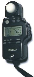
Time=20seconds ; Aperture=5.6 ; No Filter


This is my attempt to imitate the composition of one of the pictures that was assigned to me. I noticed that in the movie shot the lighting is not coming from the side where the picture is being taken but from behind and front. The picture itself is very dark since the movie still was in day light and it is very hard to imitate day light in the room and equipment that were using. The reason why the model is different in the final print and the digital is because for this project I had to re-shoot three times so I couldn't have the same model all the time.
Time=3.5seconds ; Aperture=2.8 ; No Filter


This is another attempt to imitate the movie still shot that was assigned to me. Again I had to have different models because of re-shooting. For this shot I noticed in the movie still shot that the light was coming from behind the subjects at an angle and this is what I tried to imitate with the lighting equipment in this shot.
Time = 9.5seconds ; Aperture = 2.8 ; No Filter


Again different models, this is my favorite print for this project, I really liked hot it came out, it had a better composition than the other two prints. For this shot I positioned the lighting right in back of subjects where the picture is being taken from. I noticed that I had to position them like this when I looked at the still movie shot, you can notice the lighting on the subjects hair which demonstrate that the light was coming from up and behind the subjects.
Image Bank
Mirjana Vrbaski
 The main reason why I chose this picture is because it is a photograph of Mirjana herself and the interesting thing about this photograph is that it doesn't seem so sad or dark as I was expecting, she went all white which reduced the darkness of the photograph itself. Again notice the simpleness of the picture, no hair, simple clothe, serious look in the face.
 This photograph was taken by film photographer Elliot Marks, he is one of the most famous and respected film photographers in the industry. This was on the set when they were filming the movie Pirates of the Caribbean. Elliot Marks was born in Toronto, Ontario, Canada, at first he had a career of wild life photography and then moved to still film photography, unfortunately Marks died in 2003 and since during that time he was working in the movie Starky and Hutch, after the movie was launched it was dedicated to him. I chose this picture because I liked the beam of light and how it goes together with the background.
 This photograph was taken by famous film photographer Karen Ballard, famous for working on sets for movies which include James Bond: Quantum of Solace. I chose this picture it is a simple lighting effect on which the light is the top of the subject which creates darker areas on specific places, also giving a sharper image. Karen Ballard first focused in journalistic photography in the Middle East but then ended up working for famous Hollywood movies which led her to become an award-winning photographer.
 This photograph was taken by film photographer Patti Arpaia, in this picture she was working for the movie called Head Hunter and the reason why I chose this photograph is because I liked how the lighting is coming from the right side and it kind of gives a white aura look around the character. It was hard to obtain any type of personal information for this photographer besides her filmography.
Sources:
www.youtube.com
www.google.com/images
Mirjana Vrbaski
This is very different image bank because of the fact that I actually got to meet the artist of these magnificent works of art. We got to know her opinion in photography and how she likes to work. She has a very unique style when it comes to photography, she doesn't like anything that relates too much of the present time, she prefers an image that reminds her of an event that happened way in the past. She does this by making the person look very simple, she manipulates this effect by making the person wear clothes that doesn't represent any trend, this is because she doesn't like to belong to any kind of trend, other words she doesn't like being labeled. Also the hair is something she manipulates a lot, she likes the hair to be really simple and straight, by this I mean that it is not styled in something modern. Mirjana Vrbaski was born in Canada and also grew up in Serbia and in 2006 she moved to the Netherlands which she is currently studying and working in The Hague in the Royal Academy of Art.
 This is one of the pictures taken by Mirjana and I chose this one because I feel it represents her. You can clearly notice the darkness and strictness in this photograph, the clothe and the hair brings thoughts of long time ago. Also notice the positioning, her shoulders are up, the hands, and her knees facing away from the camera. Probably one of the most important things to notice in Mirjana's art is the facial expressions, she doesn't like happy, she asks the person posing for her to have a really serious and almost sad look in the face and this is what she prefers.
 I chose this photograph because it is very similar to the one I chose before. There is something about this picture that I really like and that is how the person has his hands, he seems to be messing with them, it is hard for me to explain but I believe there is something about the hands that add up to the whole photograph.
  The main reason why I chose this picture is because it is a photograph of Mirjana herself and the interesting thing about this photograph is that it doesn't seem so sad or dark as I was expecting, she went all white which reduced the darkness of the photograph itself. Again notice the simpleness of the picture, no hair, simple clothe, serious look in the face.
 This photograph was taken by film photographer Elliot Marks, he is one of the most famous and respected film photographers in the industry. This was on the set when they were filming the movie Pirates of the Caribbean. Elliot Marks was born in Toronto, Ontario, Canada, at first he had a career of wild life photography and then moved to still film photography, unfortunately Marks died in 2003 and since during that time he was working in the movie Starky and Hutch, after the movie was launched it was dedicated to him. I chose this picture because I liked the beam of light and how it goes together with the background.
 This photograph was taken by famous film photographer Karen Ballard, famous for working on sets for movies which include James Bond: Quantum of Solace. I chose this picture it is a simple lighting effect on which the light is the top of the subject which creates darker areas on specific places, also giving a sharper image. Karen Ballard first focused in journalistic photography in the Middle East but then ended up working for famous Hollywood movies which led her to become an award-winning photographer.
 This photograph was taken by film photographer Patti Arpaia, in this picture she was working for the movie called Head Hunter and the reason why I chose this photograph is because I liked how the lighting is coming from the right side and it kind of gives a white aura look around the character. It was hard to obtain any type of personal information for this photographer besides her filmography.
Sources:
www.youtube.com
www.google.com/images


